Benchmark
![]()
Benchmark |
|
| Click on the Max Power tab. |
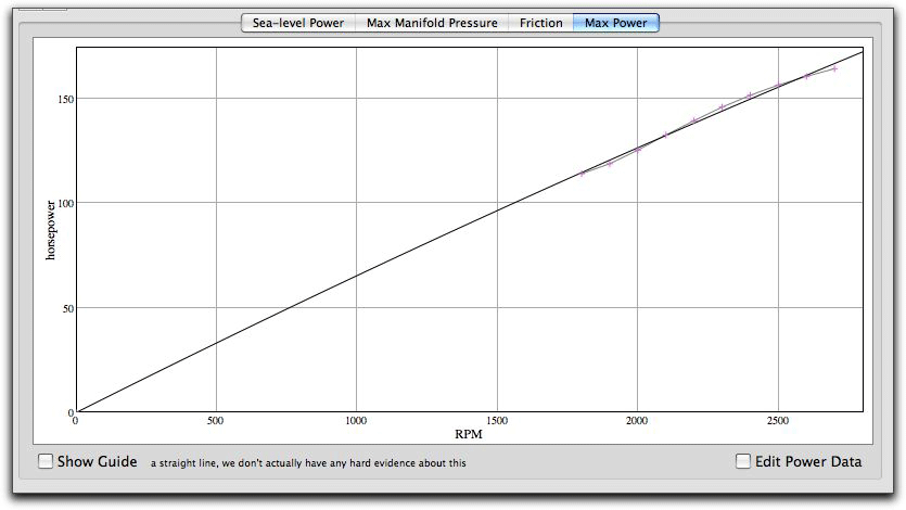
| This is the maximum power for each power data lines. |
| While we don't have any hard statistical evidence, it looks like these points are in a linear relationship with the rpm. This means that the power lines are evenly spaced along the curved maximum manifold pressure line. It's more probable that the lines are evenly spaced along intersections of a vertical line, but the difference will be very small. If we can find good evidence of this, then we will change Benchmark to reflect this. |
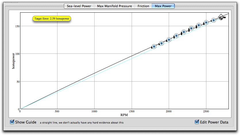
| As before, edit the curves by snapping to the lines. |
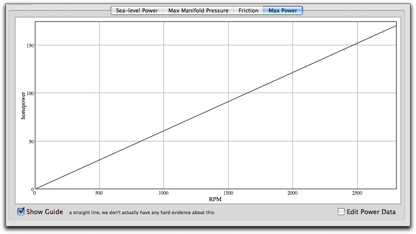
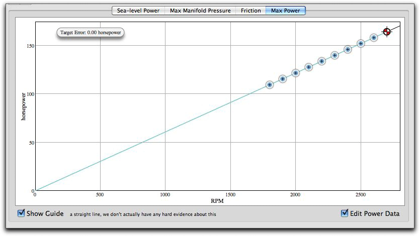
When you finish, the power data points will be along a straight line. Select the Sea-Level Power tab to look at the finished engine model. |
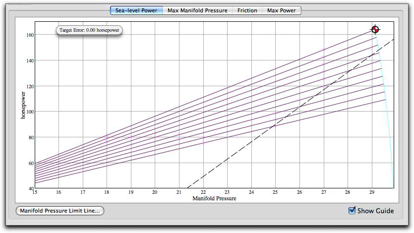
| Now we can see that the black model lines are directly on top of the violet engine data lines and all of them end at the manifold pressure guideline curve to the right. And the target error in now zero. |
![]()
![]()
|
|